Amazon A+ Content Design for Mobile
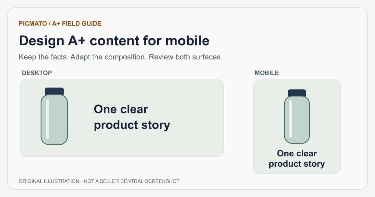
Original composition study. The illustrated content is not a live Amazon listing or a measured sales experiment.
Design mobile A+ content as a separate composition with the same approved message as desktop. Make the product easy to recognize, shorten embedded text, and keep essential information inside each module. Check the actual mobile preview in Seller Central before submitting.
The guidance here is a practical review method, not an Amazon-mandated font-size formula. Amazon's design article recommends previewing both desktop and mobile, while its best-practice announcement advises limiting text embedded in images. Those are the foundations; your module editor determines the actual asset requirements.
What should change between desktop and mobile?#
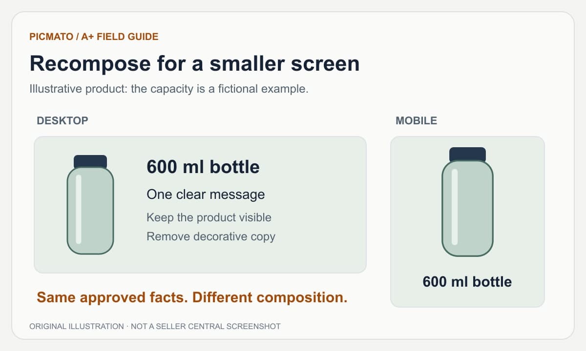
Keep the verified facts consistent while changing placement and emphasis. For a fictional bottle, a desktop image might put a product view beside a long callout. A mobile version could put the bottle above one short capacity statement, with care instructions in the next module. The facts stay the same; the route through them becomes simpler.
Do not replace a hard-to-read label with a more dramatic but unsupported claim. Simplification should remove clutter, not qualifications that change the meaning. If a condition is essential to a performance claim, preserve it legibly or leave the claim out.
| Element | Mobile adaptation | Review question |
|---|---|---|
| Headline | Reduce it to the main factual message | Can I read it without enlarging the image? |
| Product | Give the recognizable part more space | Can I tell which product and variant this is? |
| Callouts | Keep the few labels that explain the image | Does each label add useful information? |
| Background | Remove details that compete with the product | Is the subject visually distinct? |
| Qualification | Keep it readable beside the claim | Does the short version still mean the same thing? |
How much text should be embedded in an image?#
Use image text for the short message that must stay attached to a visual. Put longer explanations in the chosen module's native text fields where available. A paragraph flattened into an image cannot reflow like native text, and a long line of tiny copy will not become easier to read merely because you export at a higher resolution.
Amazon's best practices recommend native text fields, limited embedded copy, and descriptive alt text. Avoid claiming that a particular word count, font size, or alt-text tactic guarantees search visibility. Read the actual image on a phone and make the description useful to someone who cannot see it.
References: Amazon News: Improve your listings with A+ Content best practices
How do you handle module boundaries and gaps?#
Treat each exported module as an independent frame. Keep important words, product labels, faces, and measurement endpoints away from its edges. A design that appears continuous in one full-page preview can be interrupted when the platform displays modules with spacing between them.
Inspect the cut inside double-height sections too. A double section occupies two files, so it contains a real upload boundary even though you reviewed it as one generated section. Use background or empty space around that cut. The practical goal is that each file still makes sense when viewed on its own.
How does Picmato create the mobile version?#
Generate and review the desktop page first. Picmato's mobile action draws the same sections in its mobile geometry rather than exporting the desktop artwork at a smaller width. The current output is 600 x 450 pixels per mobile module and 1464 x 600 per desktop module. Those are product output specifications, not dimensions for every A+ image field.
Review the mobile result section by section. Check that wording, units, and depicted accessories agree with desktop. If you later redraw desktop content, check the mobile freshness state and update it before export. A separate mobile generation does not remove the need to inspect the final Amazon preview.
What should you check in Seller Central's mobile preview?#
Upload assets into the compatible fields of the selected Premium module, then switch between Amazon's device previews. This is where you can catch a wrong crop, unexpected spacing, missing mobile artwork, or text that feels much smaller than in your creative workspace.
Check the complete sequence as well as each image. A useful page should still explain the sold item, its fit, and its limitations when a shopper scans quickly. Ask another person to identify what is included without reading your planning document.
- The headline remains readable at the shown display size.
- The product shape, color, and sold quantity are correct.
- Important labels and qualifications are not cropped or split.
- Desktop and mobile use the same approved facts.
- Each module has accurate image description text.
- The correct ASIN and language are selected.
References: Amazon: How to create A+ Content, with design tips and examples
How can you evaluate a mobile redesign?#
Start with a readability review: can someone explain the image without zooming, and can they find the answer it was designed to give? That is a useful design check, but it is not evidence that the redesign increased sales.
For an eligible product, Amazon's Manage Your Experiments can compare A+ variants. Decide on a hypothesis before creating the alternate version, keep a record of what changed, and let Amazon's experiment complete before drawing conclusions. If you change several things at once, do not attribute the result to typography alone.
References: Amazon: Manage Your Experiments
Amazon guidance is linked beside relevant sections and in the references below. Practical design advice and illustrative examples are identified separately. Seller Central requirements and account access can change; review your current module editor before uploading.
Edited by Picmato.
Content reviewed: Nov 15, 2026
Frequently asked questions
What is the right font size for mobile A+ content?
There is no single font size that makes every A+ image readable. The result depends on the image dimensions, typeface, contrast, amount of text, and displayed size. Use a short headline, inspect the actual mobile preview, and put longer copy in native module text fields where available. Treat any fixed font-size recommendation as a design starting point rather than an Amazon rule.
Does increasing image resolution fix small text?
Higher resolution can preserve detail, but it does not make a physically small headline larger on the screen. If the message is hard to read at the intended display size, enlarge the text relative to the image, simplify the copy, or rearrange the composition. Check the exported file in Amazon's mobile preview rather than judging it only while zoomed in.
Do I need to review mobile again after editing desktop?
Yes. The mobile page can become outdated when desktop content changes. Inspect the mobile state in Picmato, regenerate or redraw as needed, and check that both surfaces still contain the same facts. Export the updated files separately and preview both in Seller Central. A previously approved mobile image does not automatically reflect a later desktop edit.
Sources & Reference Documentation
Recommended Playbooks & Market Guides
Platform policies, image compliance documentation, and conversion frameworks.
Amazon A+ Content and Brand Story: A Practical Guide
Start here for the differences between Basic A+, Premium A+, and Brand Story, then follow the creation, planning, sizing, mobile, and troubleshooting guides.
How to Create Amazon A+ Content with Picmato
A practical walkthrough from an Amazon product and a module plan to reviewed desktop and mobile images, with a checklist for Seller Central upload.
How to Plan Amazon A+ Content Modules
Give every module a job. Build a facts-led A+ brief, map single and double sections, and avoid repeating the same pitch across the page.